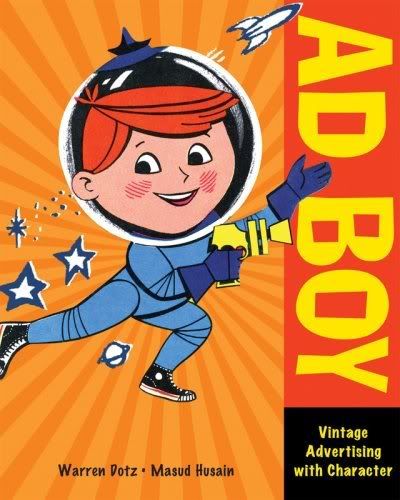
I picked this book up not too long ago, a week or two before the time of this writing. I love it, and I felt like saying my piece about it. But before I can gas on and on about Ad Boy (AB), I need to preface this review with the previous book by Warren Dotz and Masud Husain:
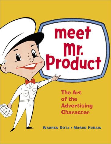
I first encountered Meet Mr. Product (MMP) in a museum gift shop in Chicago, probably 4-5 years ago. I was compelled by this thick little book, because it had page after page of cartoon characters. Bizarre, funny, and compelling, sweeping a wide dearth of topics from spark plugs to defunct fast food chains to slush drinks. I fell in love with the strangeness of it all, since, as a product of direct marketing using mascots, these... creatures (for lack of a better word) were at once familiar, and shocking in the alienness of it all (and I say it in such a good way).
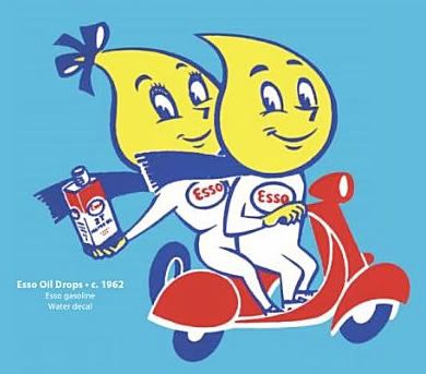
AB and MMP feature wonderfully spotlighted mascots- here's a few:
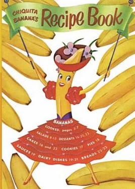
(sexy)
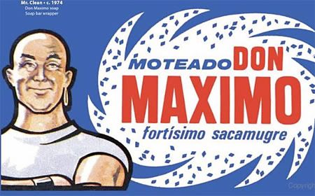
(grim)
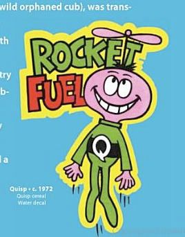
(popular with boomers)
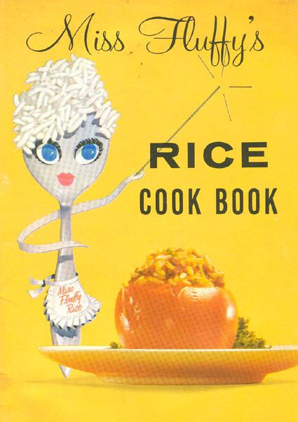
(also sexy)
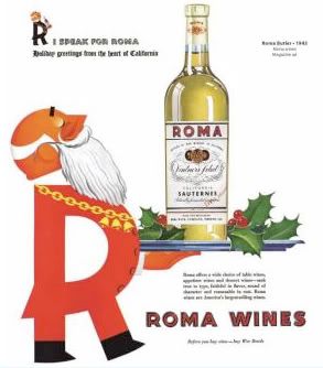
(no comment)
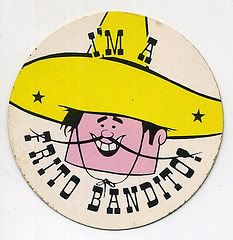
(unfairly killed before his time...)
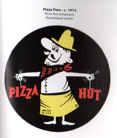
(believe it or not, Pizza Hut has a mascot, too!)
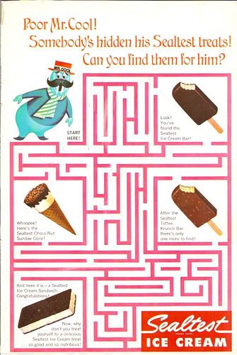
(poor fella- this one isn't from the book, but I wouldn't have known about with out MMP. Awww...)
Each page has great, detailed images and a brief description of the origin of that image (such as a hand puppet or promotional pin). And really, it's a wonderful way to show off what we buy this book for. Dotz and Husain deliver the mascot, and don't clutter it up with unnecessary copy or (heh) the product itself.
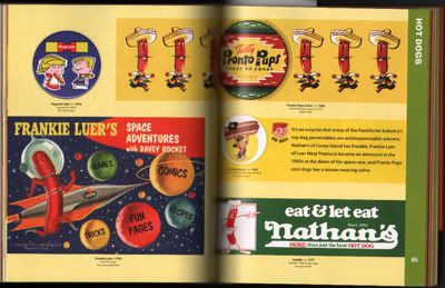
The layout of AB is very different from MMP. Since the book is bigger, it allows for more room for "longer" images (such as that corn dog ad). Bigger gives it more detail. It's also broken down into categories, not by general products selling (such as maintenance, food, public services), but by mascot types (cows, dogs, Indian Maidens, snowmen). I found this to be a better way of finding what you're looking for.
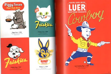
However, I what I don't like about AB is what they nail down with MMP, which is a sense of style in their layouts. Not that I think that everything should be boxed up, but a grid does keep the pages cleaner, and reduces negative space, which pops up more than once in AB.
MMP also includes a very informative and long-ish essay on mascots and their importance in America, something that is lacking in AB (the long and informative, in-depthness. There is an intro, though, don't get me wrong on that!). But since I recommend you read both, is more of a personal preference than an criticism.
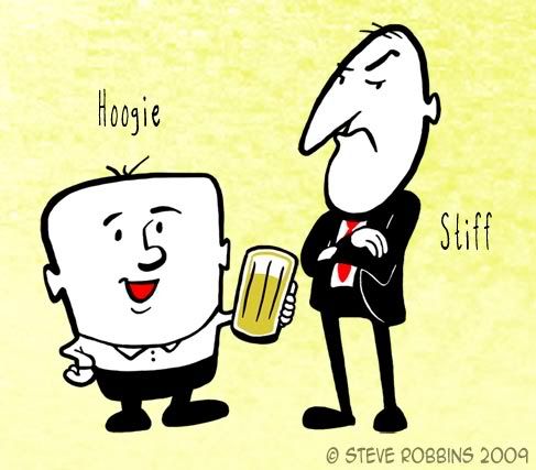
To tell you how much these books have influenced me, I've started work on a portfolio piece- sort of an homage to limited animation characters of the 50's-60's, selling with relatable cartoony characters. All that's keeping me back is that I'm still learning Adobe Flash.

Thank god for Lynda.
TTYL!

No comments:
Post a Comment