My website is: http://www.comicartiststeve.com/
I'm proud of my degree in comic art- it was hard work, and through out my time at Minneapolis College of Art and Design (MCAD), I've strived for a great set of abilities, such as draftsmanship, typography, graphic design/composition, colour theory, illustration, CAD, information management, creative writing, narrative, conceptual ideation, figure drawing, story boarding, and some light serigraphy.
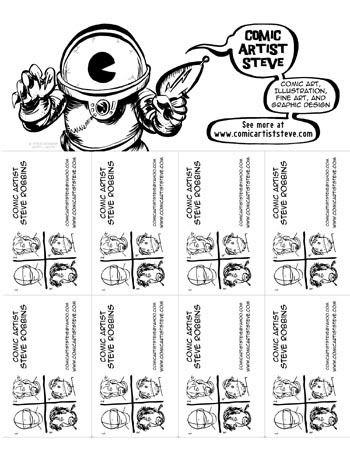
When I bought my paper trimmer (CARL brand), I also bought a ton of specialty blades (or rather, a ton of two types of specialty blades); scoring and perforating. I've started figuring out how I could use it with things like the above. Here is something that I can and have left on public bulletin boards, where people can tear off a business card, and maybe be directed to my website. It might work, it might not.
What I'm hoping with this is to attracted people with the bold, startling alien with the bold, graphically-pleasing curvy-balloons to come up to it and take a look; their curiosity driving them to understand what the threatening (yet cute!) alien is speaking. They read the text, and notice that there are business cards you can tear off the bottom (not rip!). Perhaps it amused them enough to want to see what else this guy has- it's seductively giving enough information, and yet not enough!
Then, when all the business cards are gone, the alien remains.
Relatively cheap, and viral enough to be posted anywhere. So far, I've put some up in coffee places and libraries in Roseville, so next I aim for Saint Paul and Minneapolis.
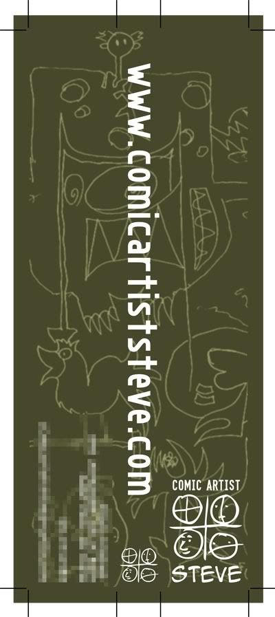
This is a spine jacket for my IRL portfolio (my phone number and address have been fuzzed out for privacy reasons, and a second version has the street and number taken off entirely). In addition to the contact information information and logo(s), the background is taken from a series of drawings I've done with others over the last 4 years. Here's an example:
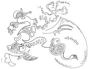
The idea is simple: I draw a line, and then you add to it, then I add to it, the you add to it... etc. I've got a lot of these done with many people. I forget who I collaborated with for this one.
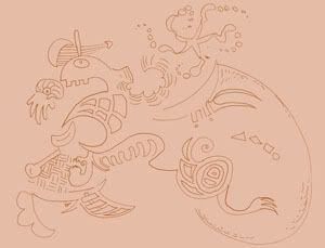
When I started making a downloadable PDF of samples, I used THIS as a background (though bigger, and not just that!). It was neutral enough to not be distracting, but interesting enough to complement the focus art.

Inverting the colour for the title cards (so to speak), helps pop the white lettering out at you.
The spine follows the aesthetic of the PDFs, and is part of my over-all personal branding.
And there we go- The first of many posts on this blog.
TTYL!

No comments:
Post a Comment